Bitcoin Rainbow Chart: Analyze BTC Price Movements
Make us preferred on Google
The Bitcoin Rainbow Chart is a visual representation of BTC price movements and its most likely support and resistance channels at any given time. It uses historical data to plot BTC prices on a logarithmic scale.
In this article, we are going to explain what the Bitcoin Rainbow Chart is, how it can be used to inform your investment decisions, and what price range we can expect BTC to reach in 2026 after the recent October rally to $126,000.
What is the Bitcoin Rainbow Chart?
The Bitcoin Rainbow Chart is a popular visualization tool used to analyze the historical price performance of Bitcoin. The chart is displayed as a rainbow-colored line graph that represents the logarithmic growth of Bitcoin’s price over time.
The Rainbow Chart is founded on a concept known as logarithmic regression, which assumes that the price of Bitcoin will keep increasing at an increasing rate in absolute terms and at a decreasing rate in relative terms.
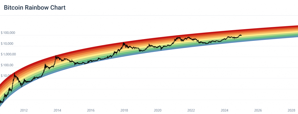
The Bitcoin Rainbow Chart consists of multiple colored bands or zones that correspond to different price ranges. The colors of the bands transition through the rainbow spectrum, with blue indicating the lower price levels and red representing the higher price levels.
How to use the Bitcoin Rainbow Chart?
The purpose of the chart is to provide a visual representation of Bitcoin’s price cycles and potential support and resistance levels. Traders and investors may use it to gain insights into the market trends and identify potential entry or exit points based on historical price patterns.
Generally speaking, when Bitcoin is trading in hotter color bands, you could consider selling your BTC as it is likely overbought, and the price might come down. On the other hand, if BTC is trading in colder color bands, the chart suggests that the currency is oversold and that it might be a good time to buy BTC as its price will likely increase.
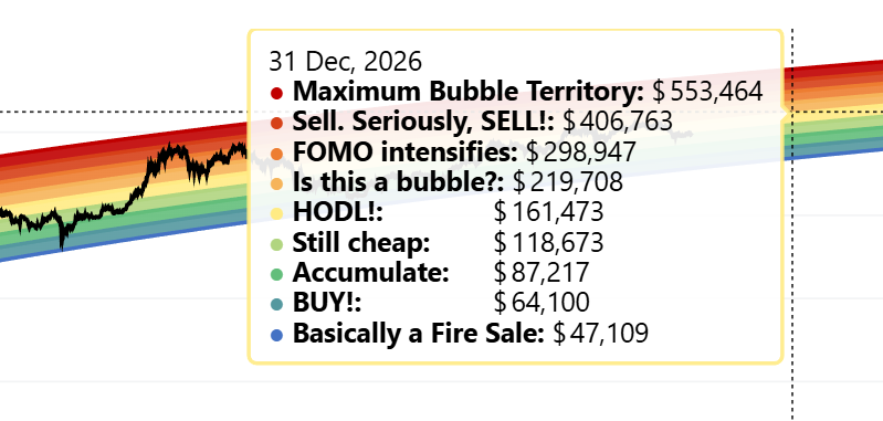
From the image above, we can see that Bitcoin is predicted to trade in a price range between $47,109 and $553,464 until the 31st of December 2026, about a year and a half until the 2028 halving. The average price the chart predicts for that period is $161,473.
Consider complimenting Bitcoin Rainbow Chart with another investment tool
The Bitcoin Rainbow Chart shouldn’t be used in isolation – that is to say that the chart shouldn’t be your only source of information. While analyzing price movements in a vacuum based on historical data is certainly valuable and has its place when making investment decisions, it doesn’t take into account day-to-day news, market trends, and other external factors that might have an impact on the price of Bitcoin.
The Bitcoin Rainbow Chart shouldn’t be used in isolation – that is to say that the chart shouldn’t be your only source of information. while analyzing price movements in a vacuum based on historica
You could consider complementing the Bitcoin Rainbow Chart by following the latest news and updates from successful and reputable investors and journalists, or use a prediction tool like CoinCheckup’s price prediction algorithm. While the price prediction tool has its faults as well, it is more finely tuned than the Rainbow Chart since it uses investor sentiment and technical analysis indicators like Simple Moving Averages (SMA) and Relative Strength Index (RSI) to form forecasts.
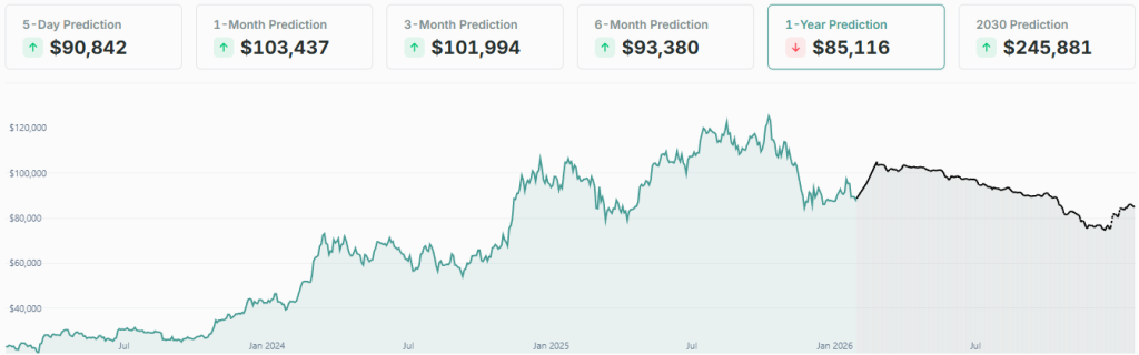
According to the Bitcoin price prediction, BTC could be headed for a period of negative price activity for most of 2026. It’s predicted to first jump back up to $100,000 in February, before dropping all the way down to around $75,000 by November. In December, it’s expected to gain 10%, ending the year at $82,054.
Pros and cons of using the Bitcoin Rainbow Chart
There are several advantages and disadvantages when it comes to the Bitcoin Rainbow Chart. In the sections below, we’re going to touch upon some of the chart’s main limitations and benefits:
Pros of the BTC Rainbow Chart:
- Provides an accessible and visually appealing way to analyze price trends
- Offers a long-term perspective on the cryptocurrency’s performance, both historical and future-focused
- Can help identify potential entry and exit points for BTC trades, optimizing trading decisions
Cons of the BTC Rainbow Chart:
- Historical price trends are not an indicator of future performance
- The chart is open to subjective interpretation, as the reasons why certain price trends form might vary between investors
- The chart is ill-equipped to take into consideration external factors or sudden market changes
The bottom line: The Bitcoin Rainbow Chart can be a helpful tool for analyzing BTC price activity
The Bitcoin Rainbow Chart is a graphical representation of BTC’s historical and future price movements plotted on a logarithmic scale. While the chart doesn’t consider external factors, it can provide valuable insight into BTC price movements in a vacuum. For a comprehensive overview of market trends, you should consider following the latest news covering the crypto and financial markets, as they are often intertwined.
If you are in search of additional investment ideas, check our weekly updated list of the best cryptocurrencies to buy based on current market conditions and trends.


